1. Introduction to Matplotlib
Matplotlib is a powerful Python library used for creating static, animated, and interactive visualizations. It is highly customizable and works seamlessly with libraries like NumPy and Pandas.Key Features:
- Supports a wide range of plots and charts- Highly customizable styles and layouts
- Works well with Jupyter Notebooks
- Can export plots in multiple formats (PNG, PDF, SVG)
2. Installing Matplotlib
You can install Matplotlib using pip:pip install matplotlib3. Basic Plotting
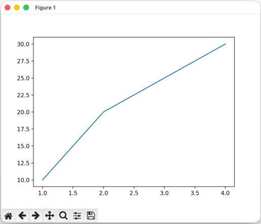
The most commonly used module is pyplot, which provides a MATLAB-like interface.import matplotlib.pyplot as plt
x = [1, 2, 3, 4]
y = [10, 20, 25, 30]
plt.plot(x, y)
plt.show()
plt.show(): Displays the plot
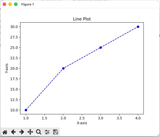
4. Line Plot
A line plot is used to visualize trends over time.import matplotlib.pyplot as plt
x = [1, 2, 3, 4]
y = [10, 20, 25, 30]
plt.plot(x, y, color='blue', linestyle='--', marker='o')
plt.title("Line Plot")
plt.xlabel("X-axis")
plt.ylabel("Y-axis")
plt.show()
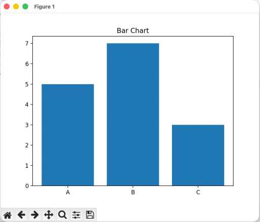
5. Bar Chart
A bar chart is used to compare categories.import matplotlib.pyplot as plt
categories = ['A', 'B', 'C']
values = [5, 7, 3]
plt.bar(categories, values)
plt.title("Bar Chart")
plt.show()
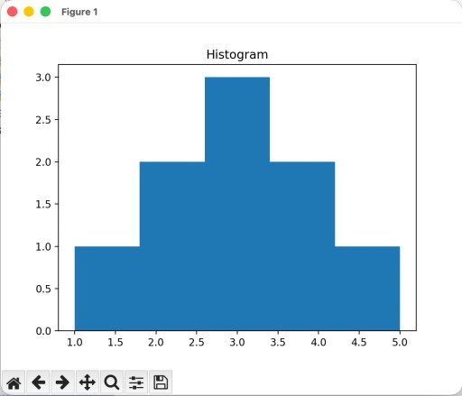
6. Histogram
A histogram shows the distribution of data.import matplotlib.pyplot as plt
data = [1, 2, 2, 3, 3, 3, 4, 4, 5]
plt.hist(data, bins=5)
plt.title("Histogram")
plt.show()
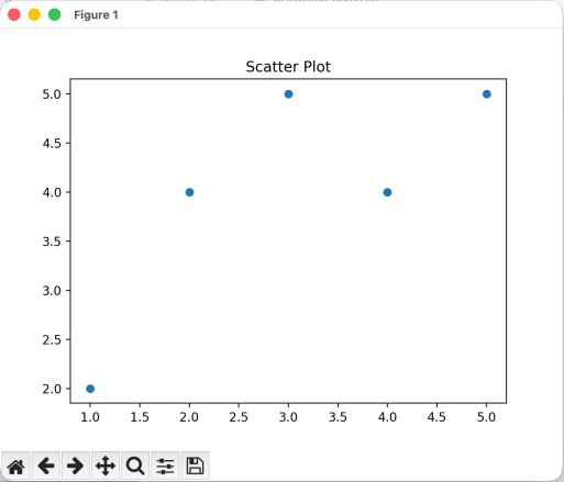
7. Scatter Plot
A scatter plot is useful for identifying relationships between variables.import matplotlib.pyplot as plt
x = [1, 2, 3, 4, 5]
y = [2, 4, 5, 4, 5]
plt.scatter(x, y)
plt.title("Scatter Plot")
plt.show()
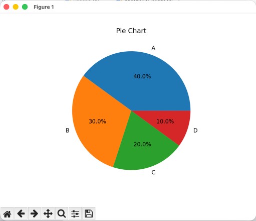
8. Pie Chart
A pie chart represents proportions.import matplotlib.pyplot as plt
sizes = [40, 30, 20, 10]
labels = ['A', 'B', 'C', 'D']
plt.pie(sizes, labels=labels, autopct='%1.1f%%')
plt.title("Pie Chart")
plt.show()
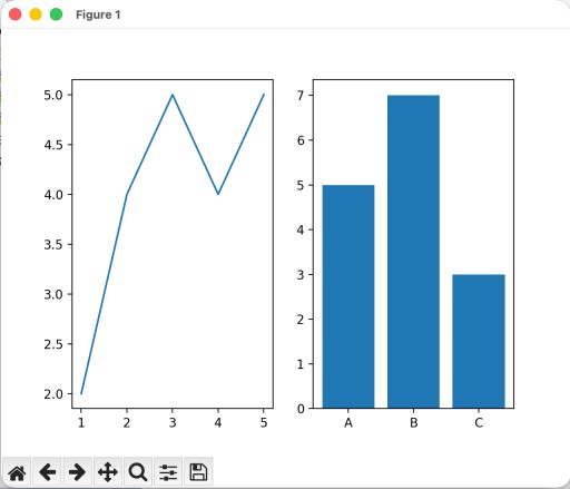
9. Subplots
You can create multiple plots in a single figure using subplots.import matplotlib.pyplot as plt
fig, ax = plt.subplots(1, 2)
x = [1, 2, 3, 4, 5]
y = [2, 4, 5, 4, 5]
categories = ['A', 'B', 'C']
values = [5, 7, 3]
ax[0].plot(x, y)
ax[1].bar(categories, values)
plt.show()
10. Customizing Plots
Matplotlib provides extensive customization options.Titles and Labels
- plt.title("My Plot") - plt.xlabel("X-axis") - plt.ylabel("Y-axis")Legends
- plt.plot(x, y, label="Line 1") - plt.legend()Grid
- plt.grid(True)11. Working with Pandas
Matplotlib integrates well with Pandas DataFrames.import matplotlib.pyplot as plt
import pandas as pd
df = pd.DataFrame({
'x': [1, 2, 3],
'y': [4, 5, 6]
})
df.plot(x='x', y='y')
plt.show()
12. Saving Plots
You can save plots to files:import matplotlib.pyplot as plt
import pandas as pd
df = pd.DataFrame({
'x': [1, 2, 3],
'y': [4, 5, 6]
})
df.plot(x='x', y='y')
plt.savefig("plot.png") # Save FIRST