Businesses use clustering to segment customers, identify purchasing behavior, group documents, detect operational patterns, organize images, and explore hidden structure in data. Its enduring popularity comes from being conceptually simple, computationally efficient, and often surprisingly effective when applied correctly.
This article explains K-Means practically, including intuition, mathematics, workflow, Python implementation, visualization, strengths, limitations, and real-world applications.
Clustering is the task of grouping data points so that observations within the same group are more similar to one another than to those in other groups. Unlike supervised learning, clustering does not use target labels. The algorithm must infer structure directly from the features.
For example, an e-commerce company may have customer data containing annual spending, visit frequency, and average basket size, but no predefined customer types. Clustering can reveal segments such as premium buyers, occasional shoppers, bargain seekers, or inactive users.
Core Idea of K-Means
K-Means divides data into K clusters, where K is chosen in advance. Each cluster is represented by a central point called the centroid. The algorithm repeatedly assigns each data point to the nearest centroid, then recalculates centroids based on assigned members. This continues until clusters stabilize.The result is a partition of the dataset into K groups with compact internal similarity.
The workflow of K-Means follows a repeating cycle. First, choose the number of clusters K. Next, initialize K centroids. Then assign each point to the nearest centroid using distance, commonly Euclidean distance. After assignments, recompute each centroid as the average of all points inside that cluster. Repeat this assign-and-update process until centroids stop changing significantly.
This iterative refinement is why the method is called K-Means, because each centroid is the mean of its cluster.
Most standard implementations use Euclidean distance, which measures straight-line closeness between points. A data point joins whichever centroid is nearest.
d = √((x1 − y1)2 + (x2 − y2)2)
In higher dimensions, the same concept extends across many features.
Imagine customer data with two features: yearly spending and website visits. If one group spends heavily and visits frequently, another spends moderately, and another rarely engages, K-Means may separate these into three clusters automatically.
The business can then design marketing strategies for each segment.
Python Example with sklearn
Below is a full example using synthetic customer data.import numpy as np
import matplotlib.pyplot as plt
from sklearn.cluster import KMeans
# Sample data: [Annual Spending, Visits per Month]
X = np.array([
[20, 2],
[22, 3],
[25, 2],
[60, 8],
[62, 9],
[58, 7],
[95, 15],
[100, 16],
[98, 14]
])
# Train K-Means model
model = KMeans(
n_clusters=3,
random_state=42,
n_init=10
)
model.fit(X)
# Results
labels = model.labels_
centers = model.cluster_centers_
print("Cluster Labels:", labels)
print("Centroids:")
print(centers)
# Plot clusters
plt.figure(figsize=(8, 5))
plt.scatter(
X[:, 0],
X[:, 1],
c=labels,
s=100
)
# Plot centroids
plt.scatter(
centers[:, 0],
centers[:, 1],
marker="X",
s=250
)
plt.xlabel("Annual Spending")
plt.ylabel("Visits per Month")
plt.title("K-Means Customer Segments")
plt.grid(True)
plt.show()
Output:
Cluster Labels: [2 2 2 0 0 0 1 1 1]
Centroids:
[[60.          8.        ]
 [97.66666667 15.        ]
 [22.33333333  2.33333333]]
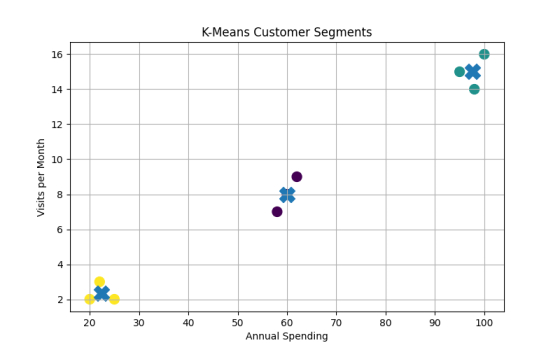
One cluster represents low spenders, another medium spenders, and another premium customers.
Choosing the Value of K
One of the most important practical decisions is selecting the correct number of clusters. Since K must be chosen before training, engineers often test multiple values. A common method is the Elbow Method, where clustering error is plotted against K and the bend in the curve suggests a good tradeoff.import matplotlib.pyplot as plt
import numpy as np
from sklearn.cluster import KMeans
# Sample data: [Annual Spending, Visits per Month]
X = np.array([
[20, 2],
[22, 3],
[25, 2],
[60, 8],
[62, 9],
[58, 7],
[95, 15],
[100, 16],
[98, 14]
])
# Store inertia values
inertia = []
# Try different K values
for k in range(1, 7):
km = KMeans(
n_clusters=k,
random_state=42,
n_init=10
)
km.fit(X)
inertia.append(km.inertia_)
# Plot Elbow Method graph
plt.figure(figsize=(8, 5))
plt.plot(
range(1, 7),
inertia,
marker="o"
)
plt.xlabel("K")
plt.ylabel("Inertia")
plt.title("Elbow Method")
plt.grid(True)
plt.show()

The ideal K in this Elbow Method graph is most likely: K = 3
The Elbow Method looks for the point where adding more clusters stops giving major improvement.
In this graph:
- From K = 1 → 2, inertia drops sharply
- From K = 2 → 3, inertia drops sharply again
- After K = 3, the curve becomes almost flat
That means after 3 clusters, adding more clusters gives only small benefits.
Feature Scaling
K-Means is distance-based, so feature scale matters greatly. If annual income ranges from 0 to 100000 while visits range from 0 to 20, income may dominate distance calculations. Standardization or normalization is often essential.import numpy as np
import matplotlib.pyplot as plt
from sklearn.preprocessing import StandardScaler
from sklearn.cluster import KMeans
# Example dataset: [Annual Income, Monthly Visits]
X = np.array([
[25000, 2],
[32000, 3],
[48000, 5],
[62000, 8],
[78000, 10],
[95000, 15]
])
# Apply standardization
scaler = StandardScaler()
X_scaled = scaler.fit_transform(X)
print("Scaled Data:")
print(X_scaled)
# Train K-Means on scaled data
model = KMeans(
n_clusters=3,
random_state=42,
n_init=10
)
model.fit(X_scaled)
print("\nCluster Labels:")
print(model.labels_)
print("\nCentroids:")
print(model.cluster_centers_)
# Plot clustered data
plt.figure(figsize=(8,6))
# Scatter plot of data points
plt.scatter(
X_scaled[:, 0],
X_scaled[:, 1],
c=model.labels_,
cmap='viridis',
s=120,
edgecolors='black',
label='Data Points'
)
# Plot centroids
plt.scatter(
model.cluster_centers_[:, 0],
model.cluster_centers_[:, 1],
c='red',
marker='X',
s=250,
label='Centroids'
)
# Labels and title
plt.xlabel("Scaled Annual Income")
plt.ylabel("Scaled Monthly Visits")
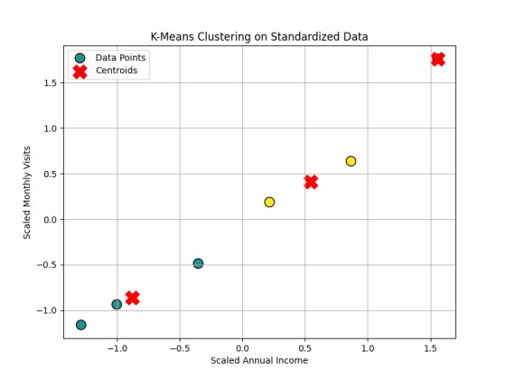
plt.title("K-Means Clustering on Standardized Data")
plt.legend()
plt.grid(True)
plt.show()
Output:
Scaled Data:
[[-1.28578116 -1.16095912]
 [-1.00155585 -0.93625736]
 [-0.351898   -0.48685383]
 [ 0.21655262  0.18725147]
 [ 0.86621047  0.636655  ]
 [ 1.55647193  1.76016383]]

Cluster Labels:
[1 1 1 2 2 0]

Centroids:
[[ 1.55647193  1.76016383]
 [-0.879745   -0.86135677]
 [ 0.54138154  0.41195324]]
Conclusion
K-Means is fast, easy to implement, scalable to large datasets, and often provides intuitive segmentation results. It works especially well when clusters are compact, well-separated, and roughly spherical in shape. Because of this, it remains a common first clustering algorithm.K-Means requires choosing K in advance. It is sensitive to initialization, though modern implementations reduce this issue. It struggles with irregularly shaped clusters, clusters of different density, and strong outliers. Since it uses means, extreme points can distort centroids. It also assumes numeric features and meaningful distance metrics.
K-Means Clustering is one of the foundational algorithms of unsupervised learning. It groups unlabeled data into meaningful segments by repeatedly assigning points to nearest centroids and updating cluster centers. With proper scaling, thoughtful K selection, and careful interpretation, it can reveal highly valuable patterns.
Although more advanced clustering methods exist, K-Means remains timeless because many practical problems reward speed, clarity, and useful structure discovery.